
MI FIT REDESIGN
[UI Art Direction / UX Design / Product Design]
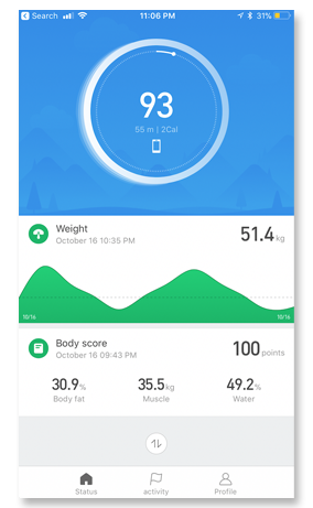
Mi Fit is the official companion app for Mi Band and Mi Scale. It syncs data from the band and the scale day and night. Users can use Mi Fit to set, track, and follow health and fitness all the time.
Course
Advanced Models and
Speculative Interfaces
Type and Timeline
Product Design, UI/UX
Oct - Nov 2017
Team
Individual Project
Tools Used
Illustrator, Photoshop, Sketch,
and InVision
Competitor Analysis
Devices
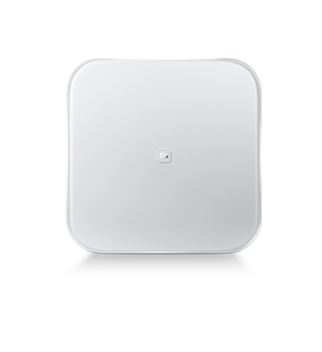
Mi Scale
- US $45.49
- Measures weight, body mass index (BMI), body fat and water percentage, and muscle mass and bone mass.
- Wirelessly sync data to the mobile device.
- Mi Scale recognizes up to 16 different users.
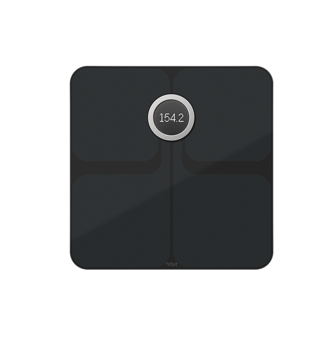
Fitbit Aria
- US $99.95
- Measures weight, body mass index (BMI), body fat and water percentage, and muscle mass and bone mass.
- Wirelessly sync data to the mobile device.
- Aria recognizes up to 8 different users.
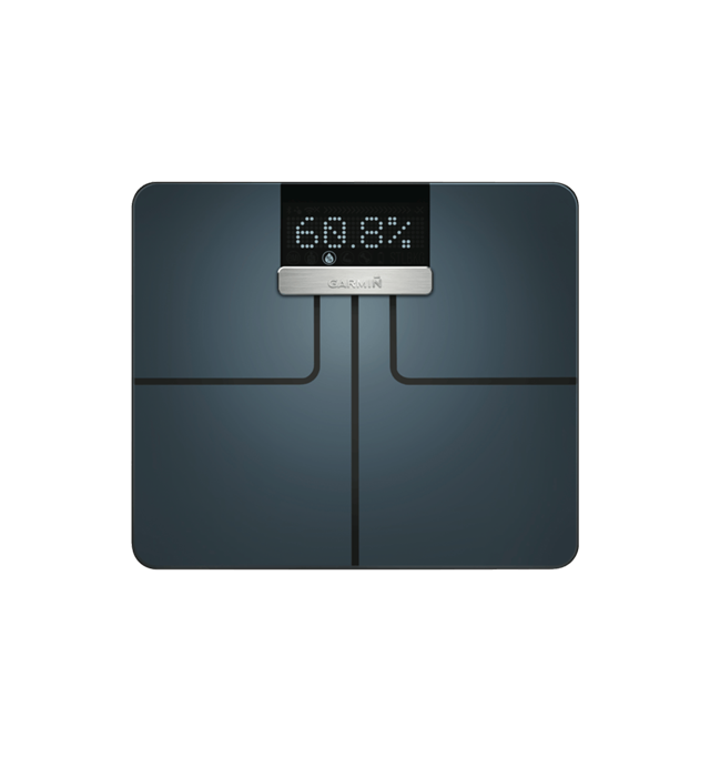
Garmin Index
- US $149.99
- Measures weight, body mass index (BMI), body fat and water percentage, and muscle mass and bone mass.
- Wirelessly sync data to the mobile device.
- Index recognizes up to 16 different users.
Companion App
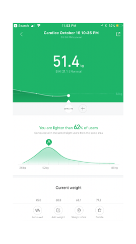
Mi Scale
- The layout looks very simple and clean.
- The green colour is not fit the UI look, it falls too flat and seems not interactive.
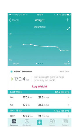
Fitbit Aria
- The colour scheme is nice.
- The spacing and text information are not controlled well.
- Hierarchy is not clear enough.
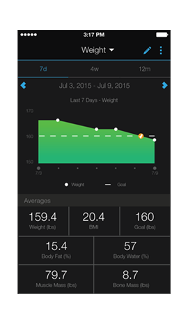
Garmin Index
- Black background create strong visual contrast, and it matched the companion device.
- Saturated green looks very energetic.
- Layout is organized and clear.
- Different font sizes create a strong hierarchy.
Current App
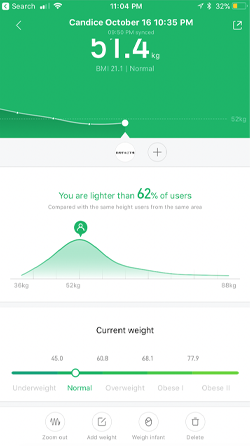
The Issue
- There are no major issues with the current app, and it is very simple to use.
- The user interface and experience definitely need to be improved.
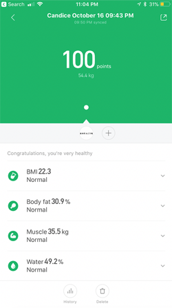
Color
- The colour scheme is the weakest part of the interface, it does not consistent and matches the companion device.
- The green colour is too plain and boring, it will be better to add a little gradient colour or texture to show more variations.
User Interface
- It has a poor layout, and the hierarchy is not strong enough.
- Icon sets are hard to distinguish and the readability needs to be improved.
- The area chart falls too flat.
- The typography looks good overall, but some of the size and weight need to be emphasized.
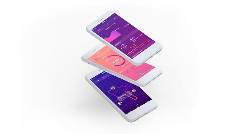
Redesign
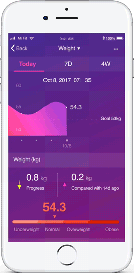
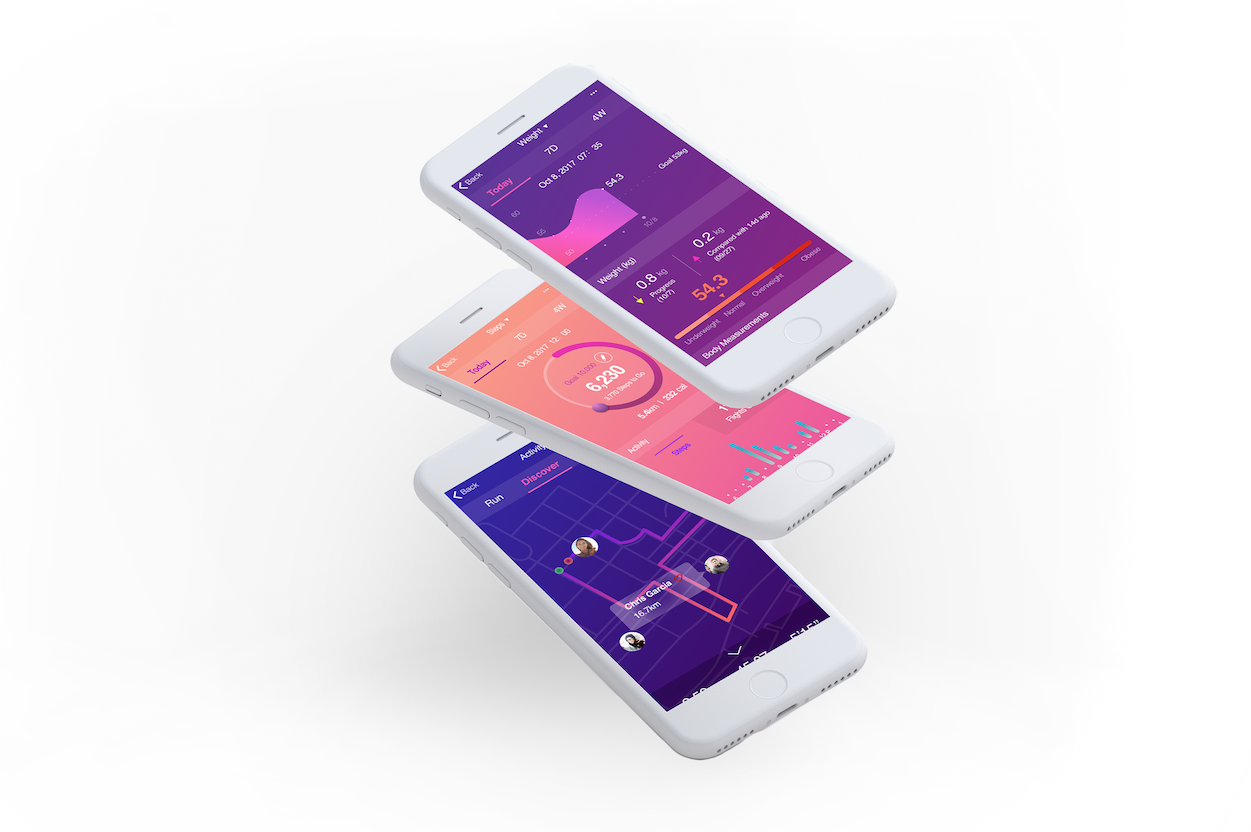
Weight
- Add the title and removed extra information.
- Added a new function, users can easily access the 7 days and 4 weeks weight trends.
- Changed the color scheme by adding gradient color to show more variations.
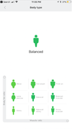
- Added the body measurement index.
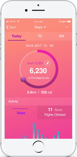
Steps
- Increase the font size and weight to enhance the readability.
- Changed the weight section to detailed hourly step data.
New Feature - Activity
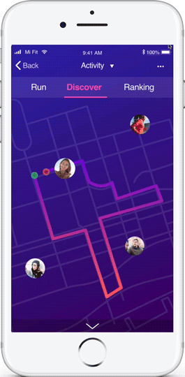
Data collected by activity track (Mi Band).
- The new feature will illustrate a user's running path and calculate the distance.
- Users can also discover other nearby users and give them like to encourage each other.
- Users can easily swipe up to check the activity status summary at the bottom or swipe down to hide it.
Visual Design
Selected Works
TaoBao RebrandBrand design
VolkswagenUI/UX Design
The Crazy OnesType in Motion

International Design AwardsType in Motion
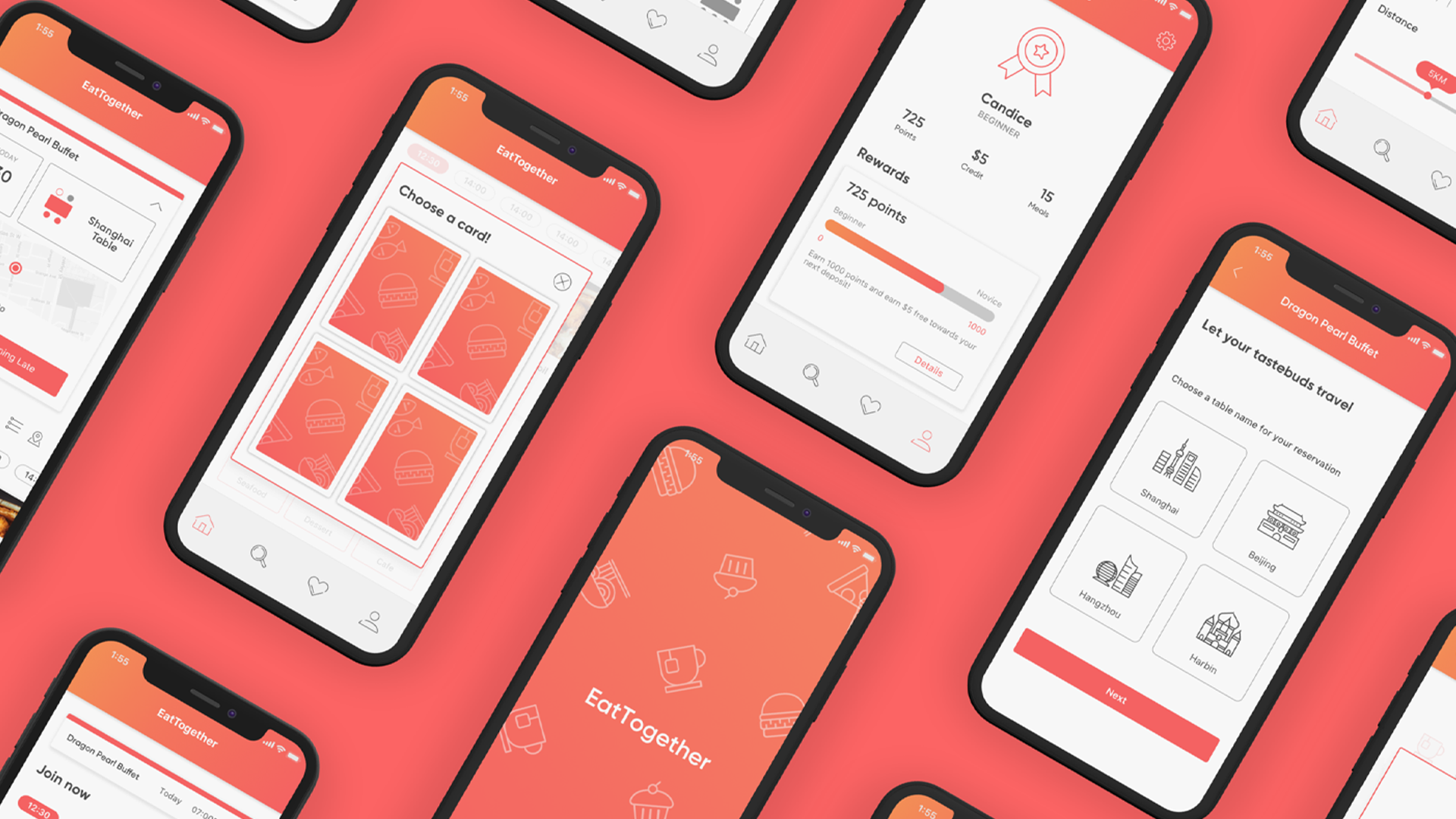
Eat TogetherUI/UX Design

VisitERUX Design
Anti-HypeExperimental Graphic Design
Mi FitMi Fit