EAT TOGETHER
[UI Art Direction / UX Design / Product Design / Brand Design]
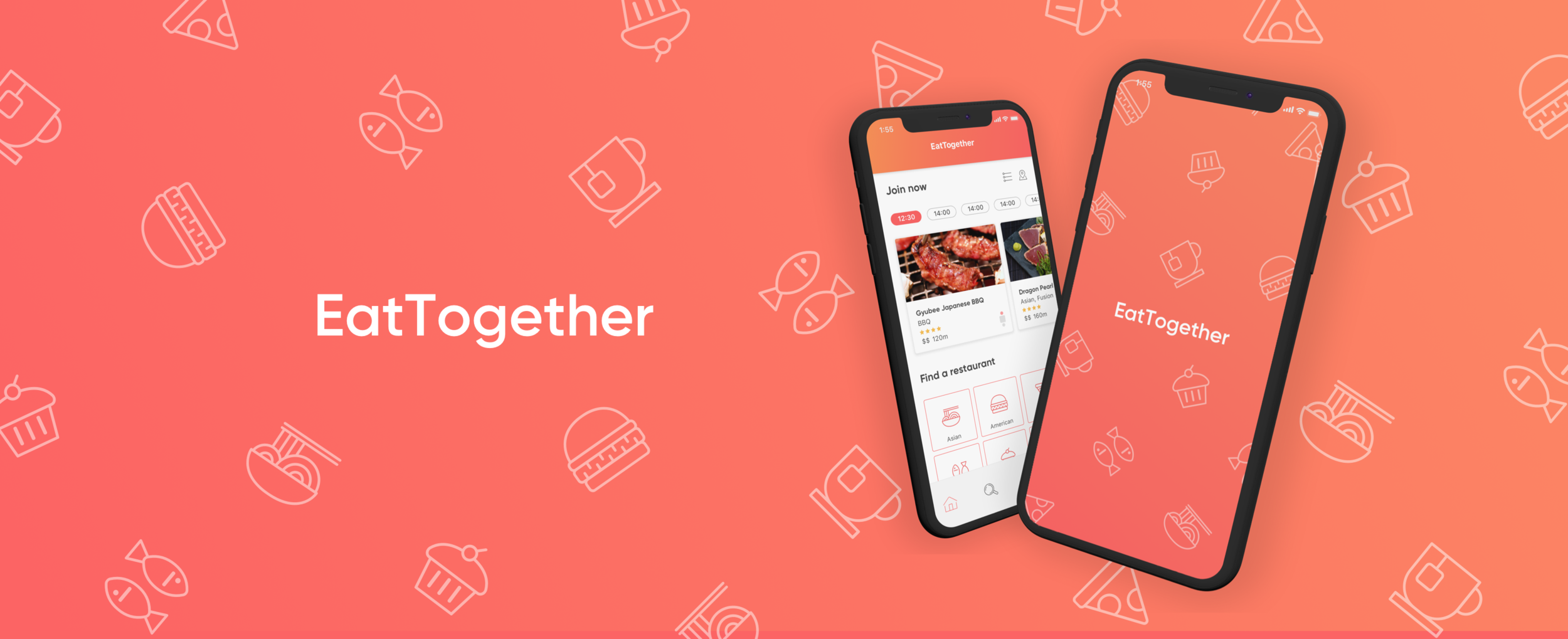
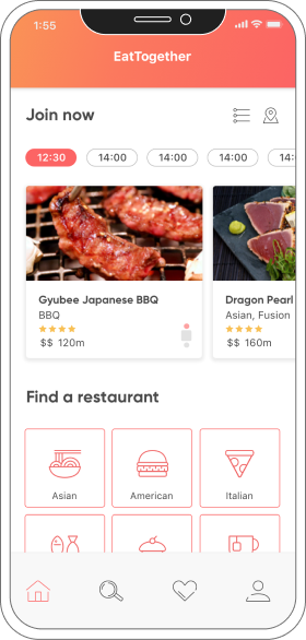
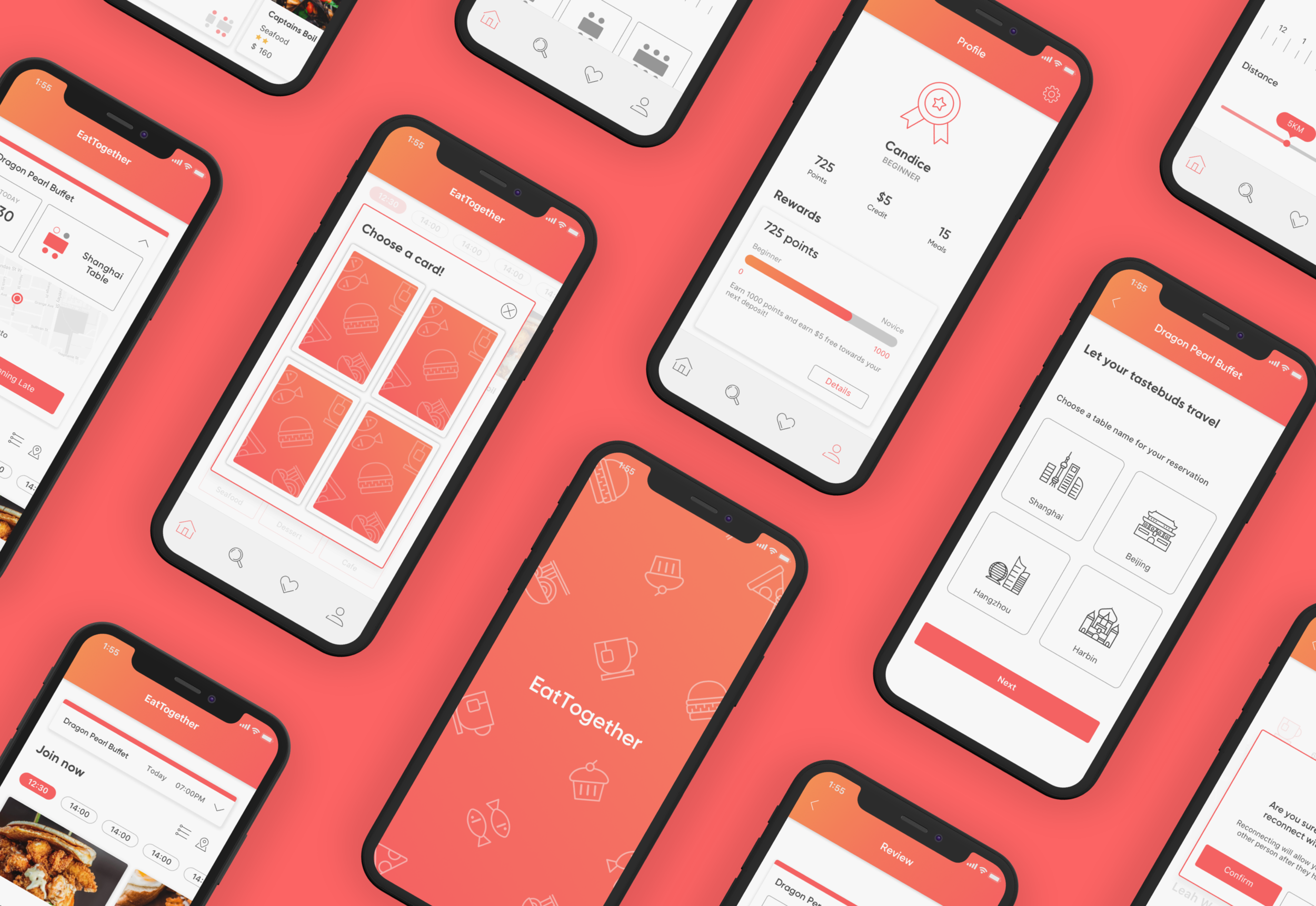
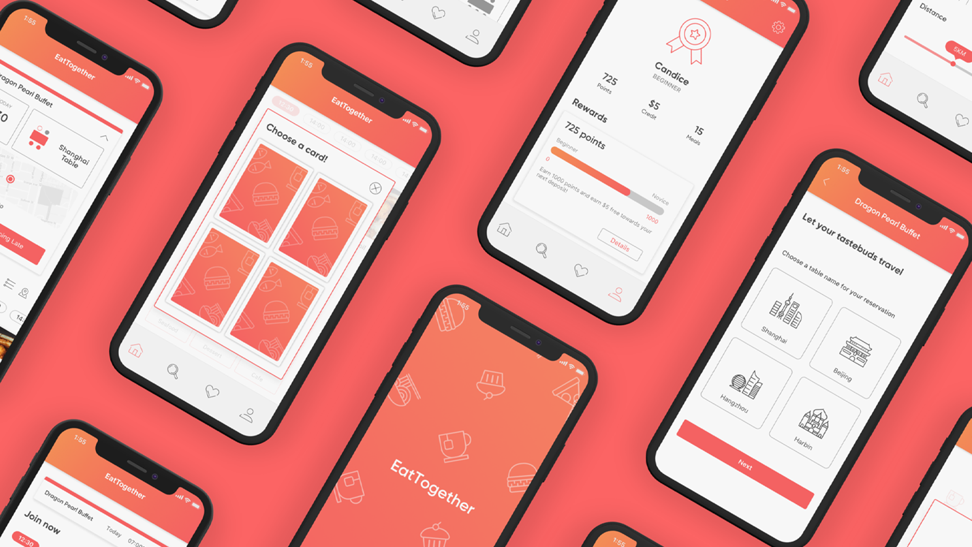
EatTogether is an app that aims to bring strangers of diverse backgrounds together through sharing a casual meal at a restaurant/café.
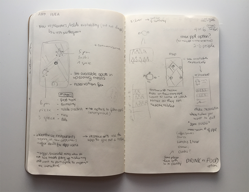
By selecting their location, users will dine with other people who have chosen the same place and table size. Diners will meet first in person rather than online to avoid pre-selection based on appearances in order to foster an open-minded and safe space.

RGD's 2019 Student Awards
Milestone Integrated Award for Digital Marketing Design
My Role
User Research, Ideation, Visual Design, User Testing and Promotional Video
Team
Leah Wei, Cheston Sin, Ian Orden
Understanding the Problem
Loneliness
Although we live in a world that is more connected than ever digitally, it seems to have become harder to meet people outside of our everyday lives.
Loneliness is subjective. It doesn’t always mean being alone or not having friends. It is the discrepancy between the social relations you want compared to the ones you have.
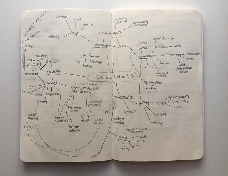
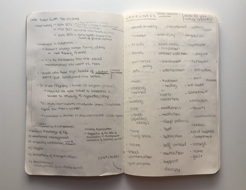
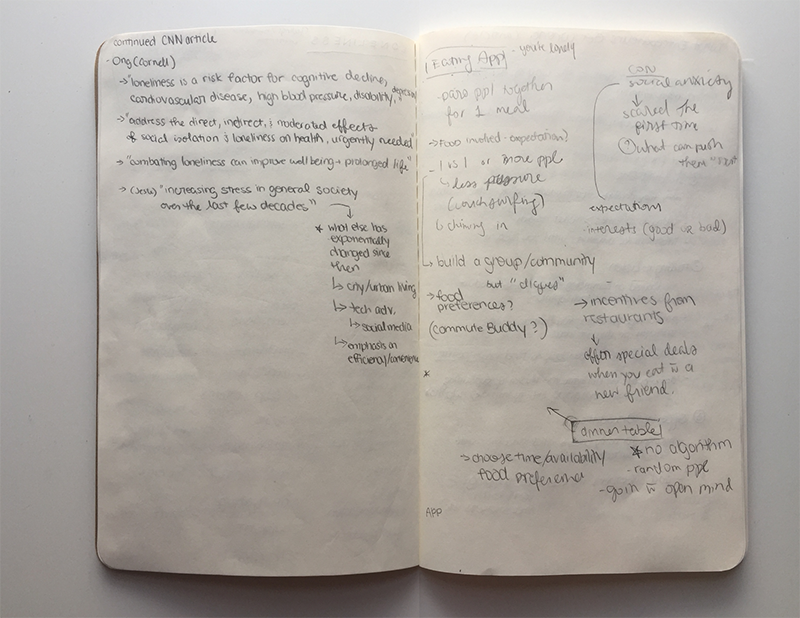
To solve the problem, you can join a group or club if you’re really keen on a particular topic. Attend a networking event or social gathering in attempts to find one meaningful connection. Or like most people, download a socializing app for a specific type of relationship like dating.
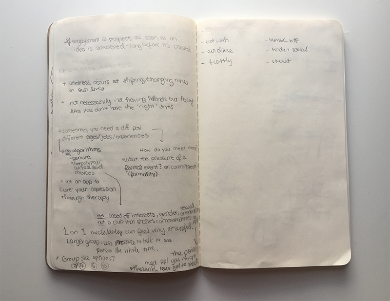
But what if you simply want to meet people without any preset expectations, filtration systems or superficial swiping?
Design Challenge
How might we design a social app that encourages users to be open-minded and to meet someone new through a shared restaurant meal without any pressure or judgement?
Our Solution
A new way to meet people
Eat Together is geared towards fostering diverse encounters, we’ll have a broad range of adult users from various backgrounds. People of all different genders, sexualities, ethnicities, cultures, ages, and occupations will be encouraged to use the app. Their identity will be kept anonymous from one another in order to prevent predisposed judgments and expectations from other diners.
Initial Research
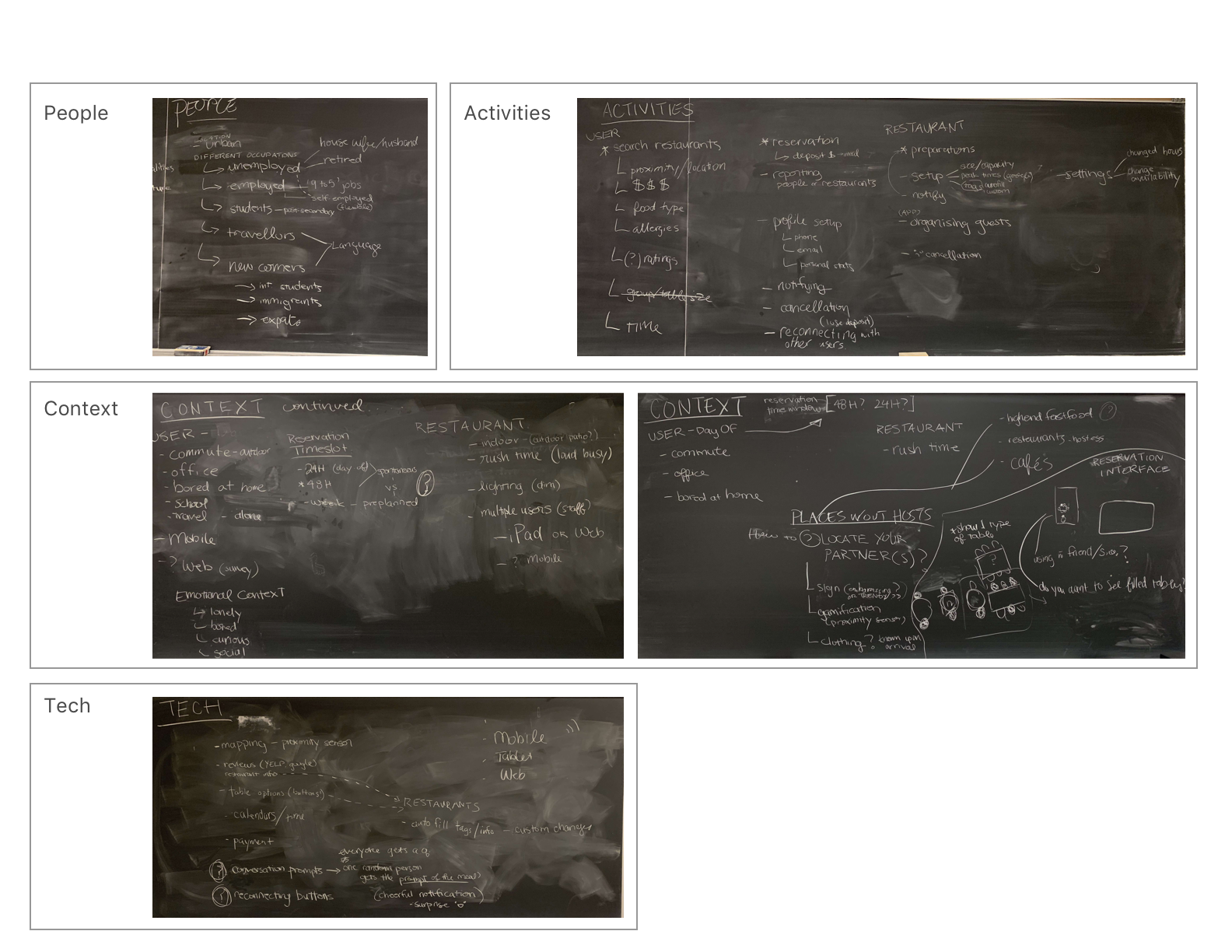
Our research began with speaking about the related subject casually with our peers. The conversations revolved around the experience of meeting someone new and how they go about it. Questions about whom they eat out with and how often they go out to eat were also brought up. After these conversations, we were able to narrow down our target audience and as well as key functions of our app. We then did the competitor analysis by Identifying and analyzing the strengths and weaknesses of existing social apps.
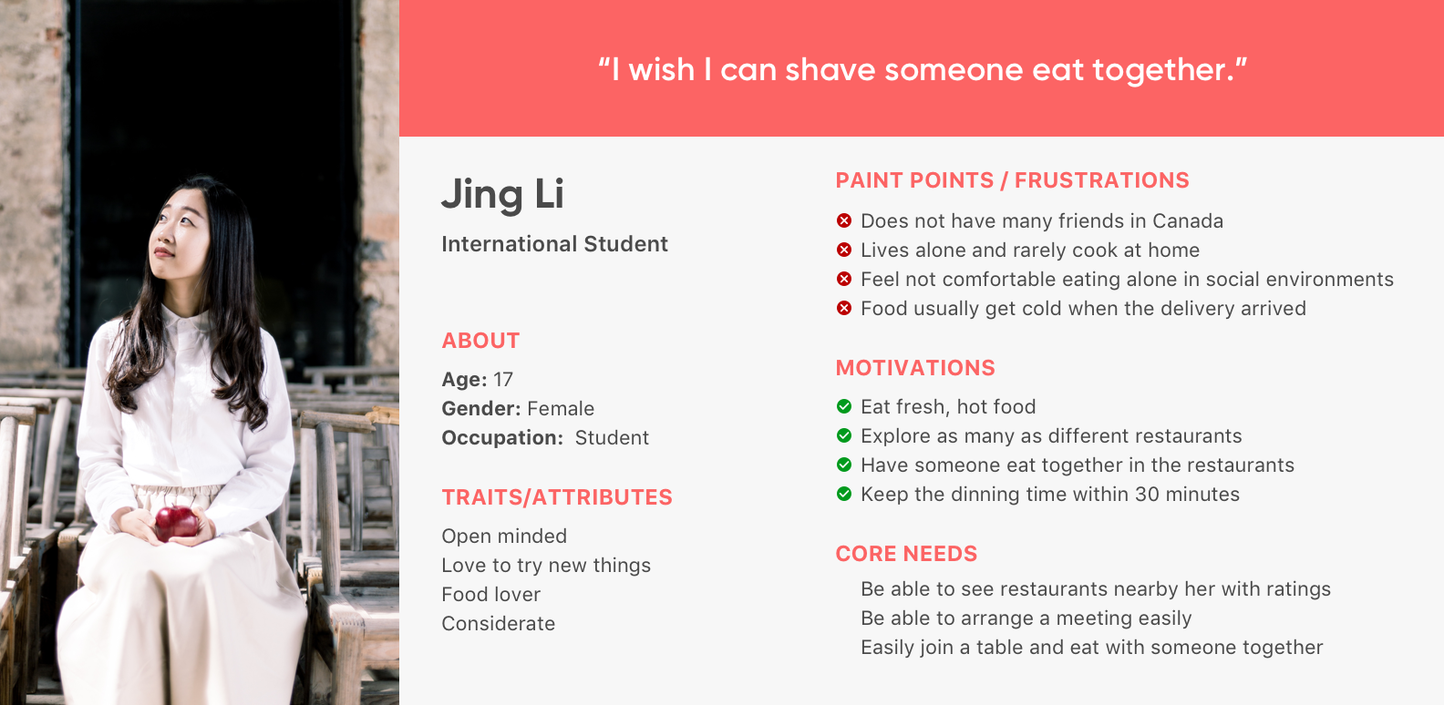
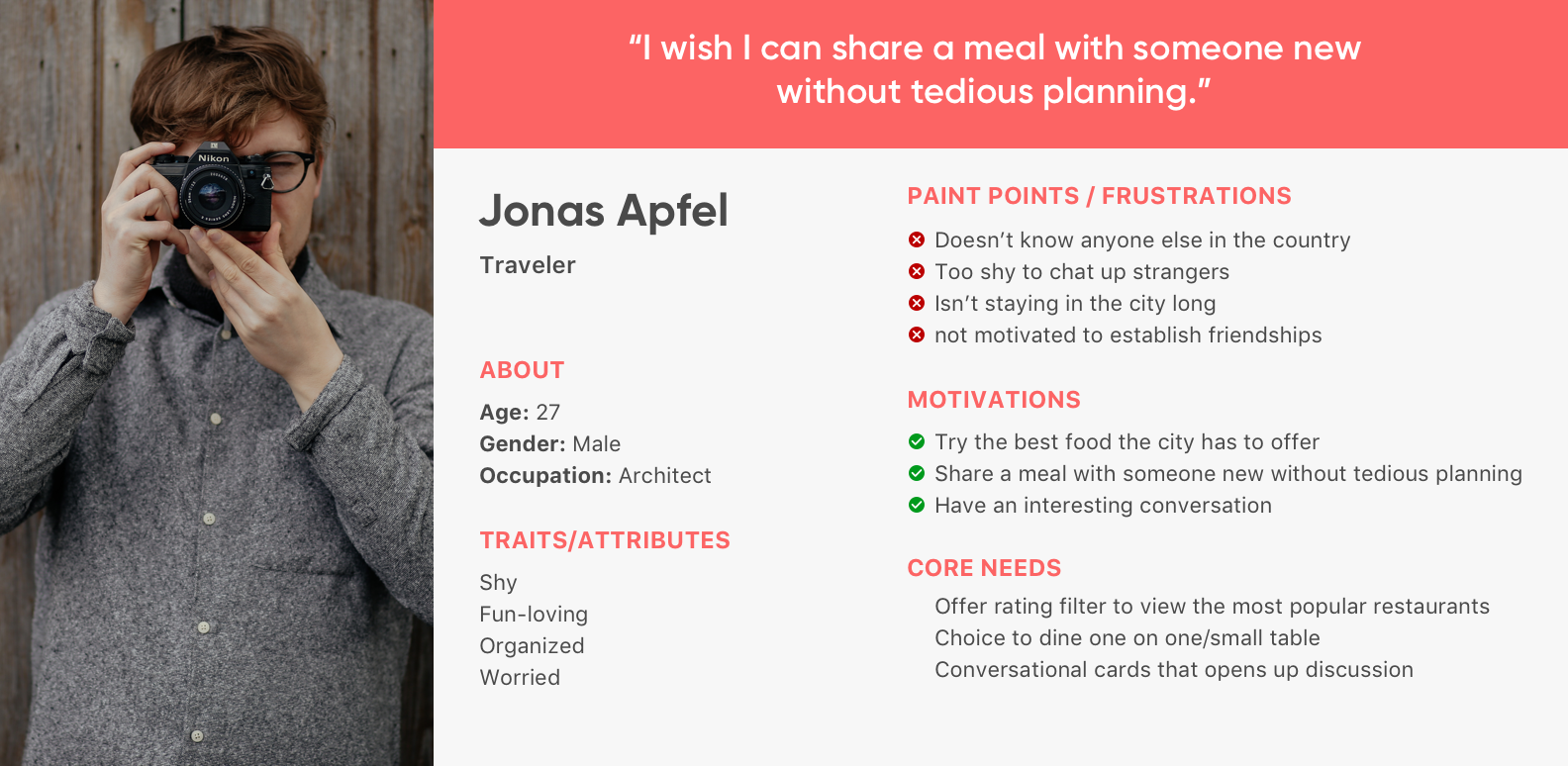
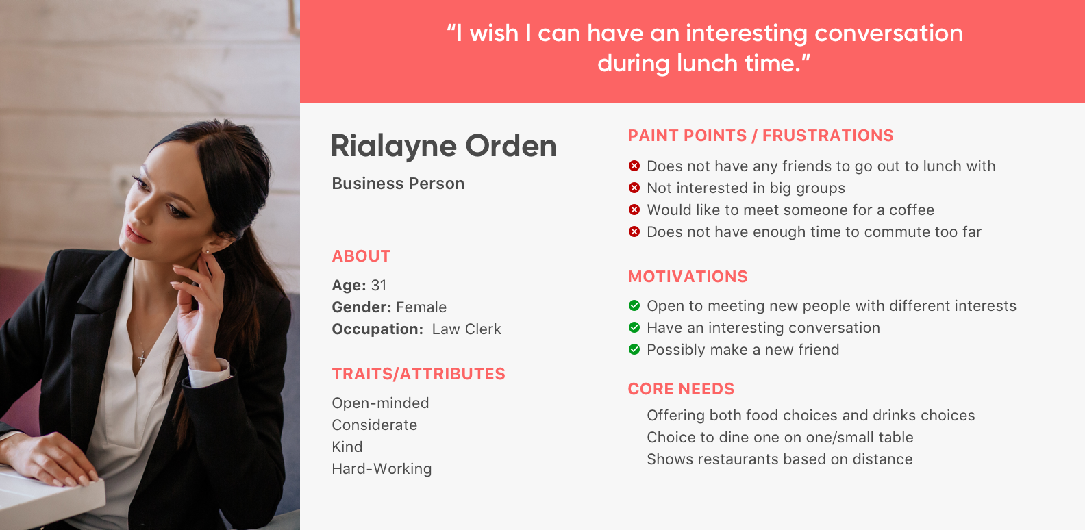
After our interviews, we assembled and organized our findings into a PACT Analysis and came up with user personas based on the target audience that the app will focus on. According to Moscow Method, we developed a System Requirement Chart listing features and functions the app will have.
PACT Analysis
User Personas
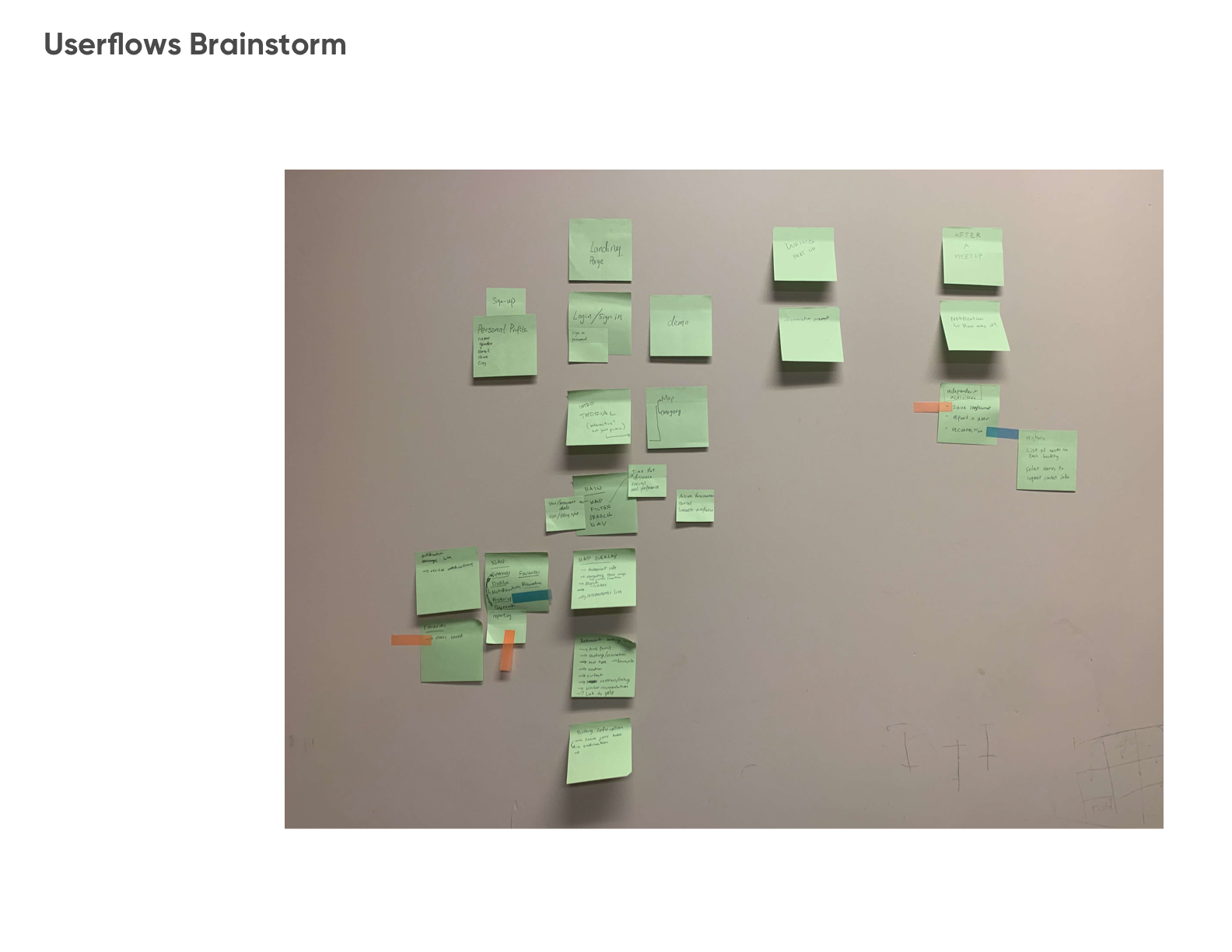
Userflows
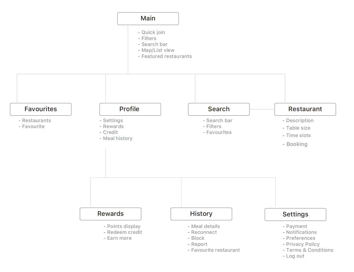
After brainstorming potential functions and features for our app, we created a site map outlining where each feature would be located. It provides a clear expression of the primary navigation and allows us to see our app's organization and how content nodes will relate to one another.
Sketches and Wireframes
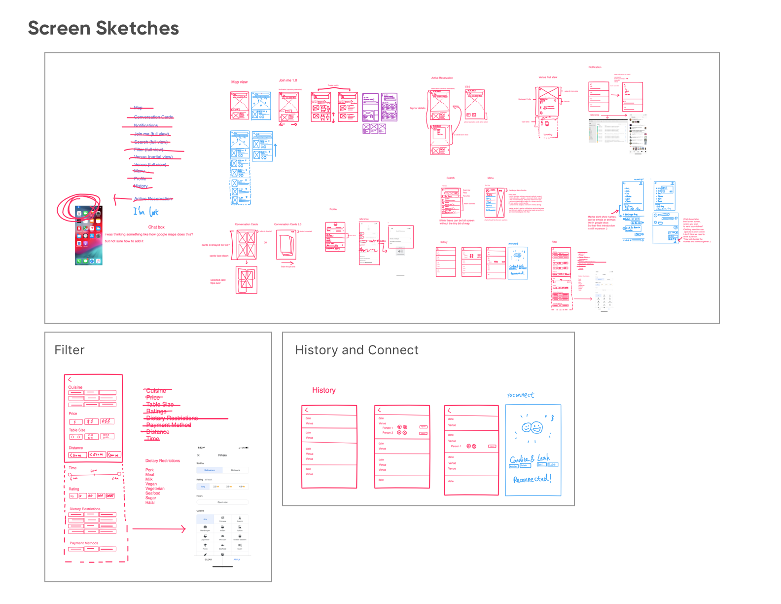
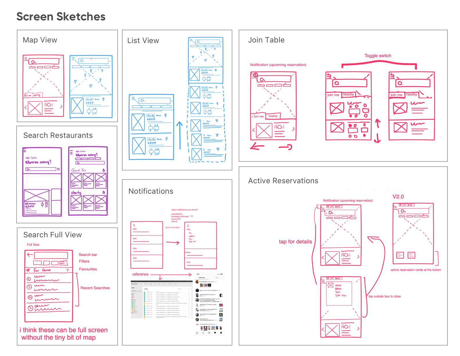
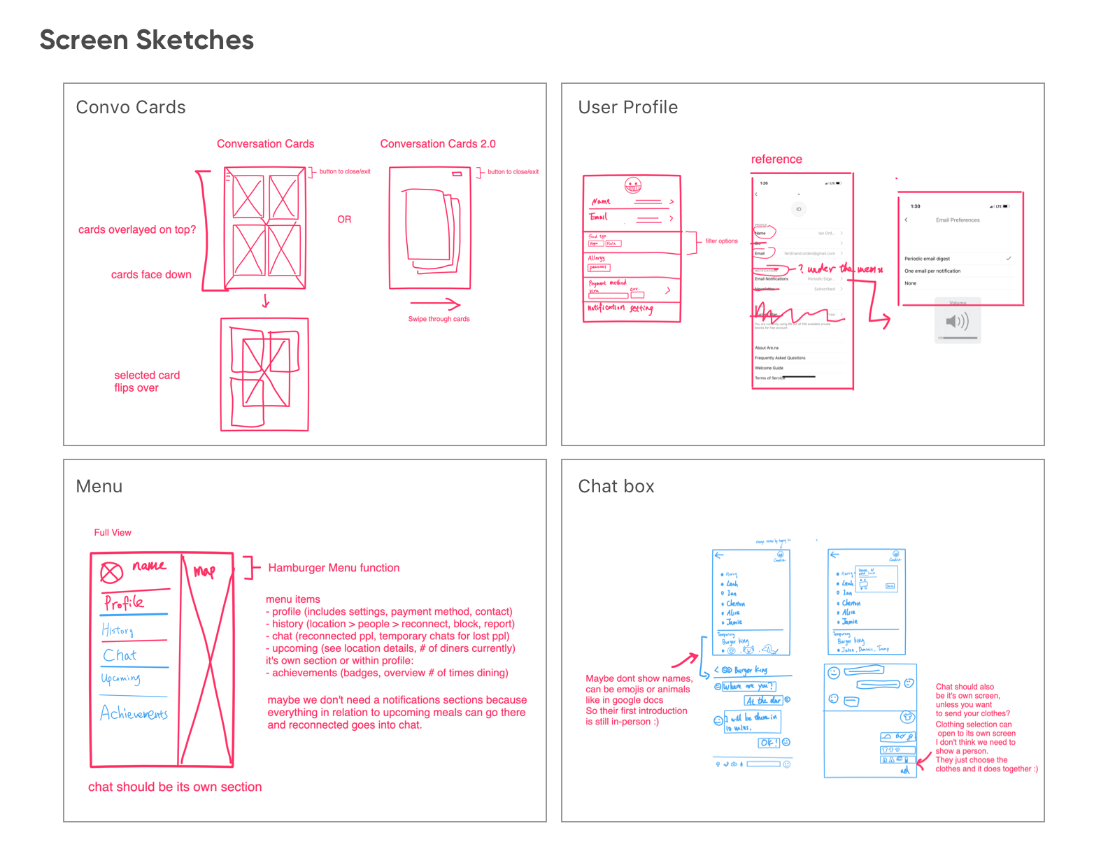
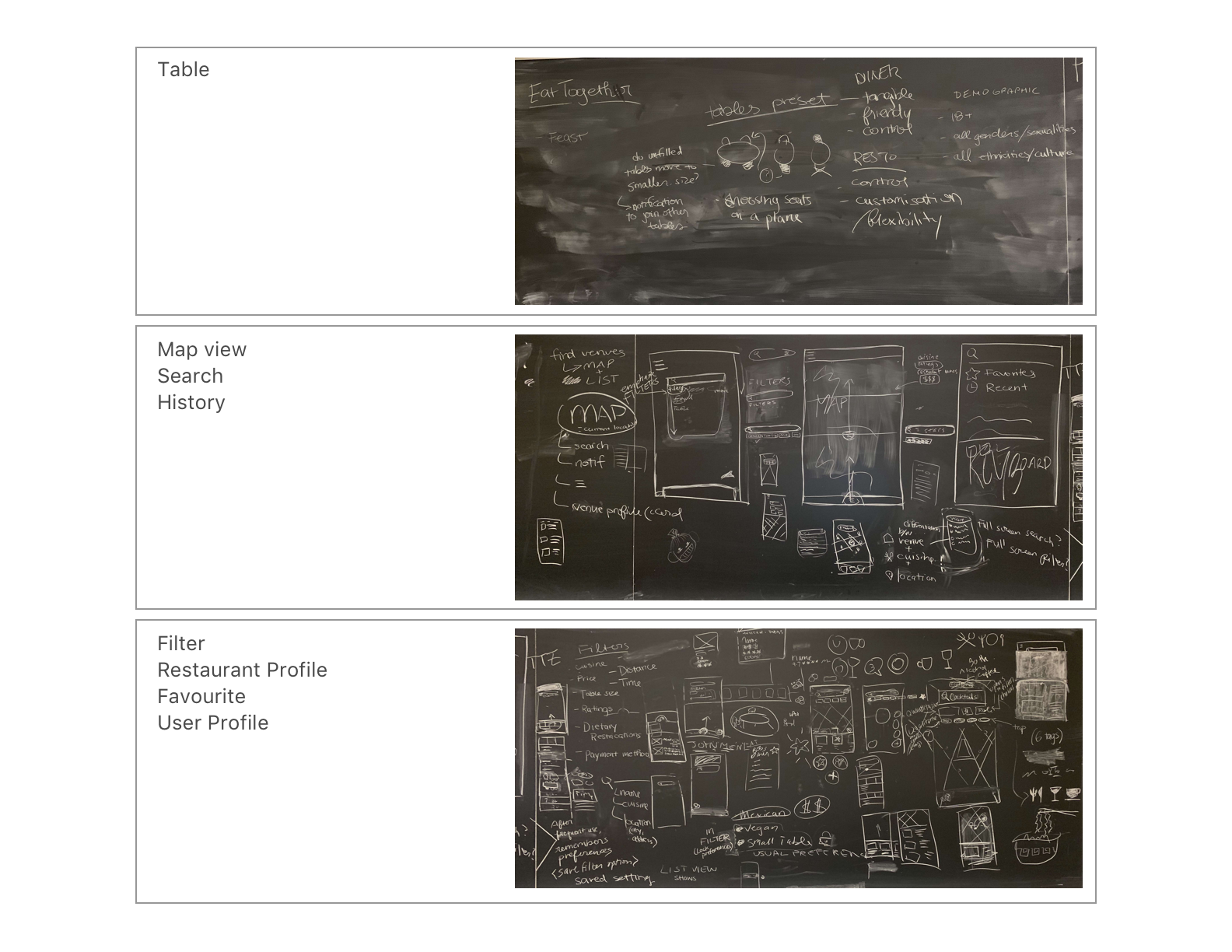
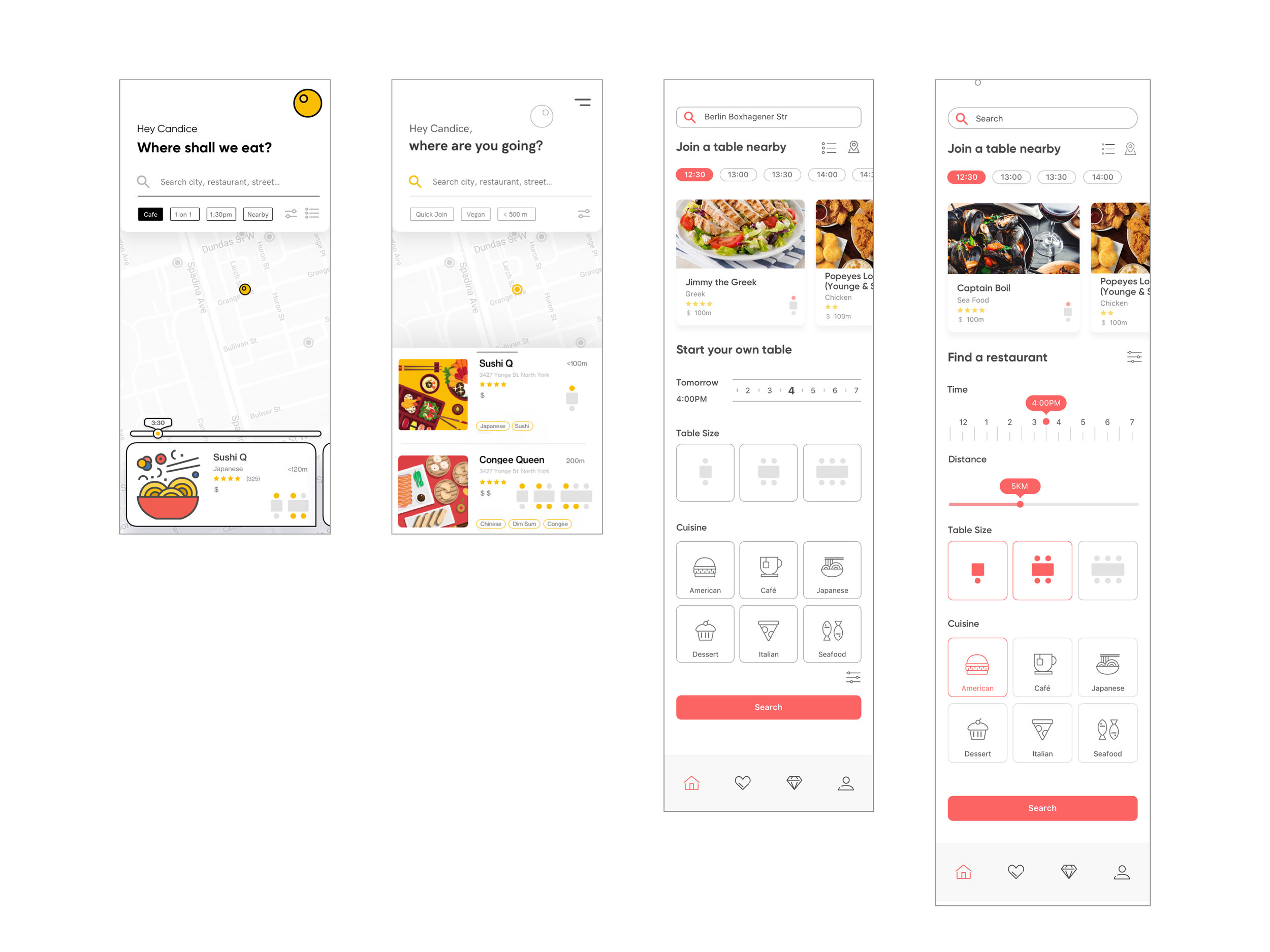
Sketches and Wireframes
We have experimented on a variety of different styles to capture the overall visual approach.
Visual Design
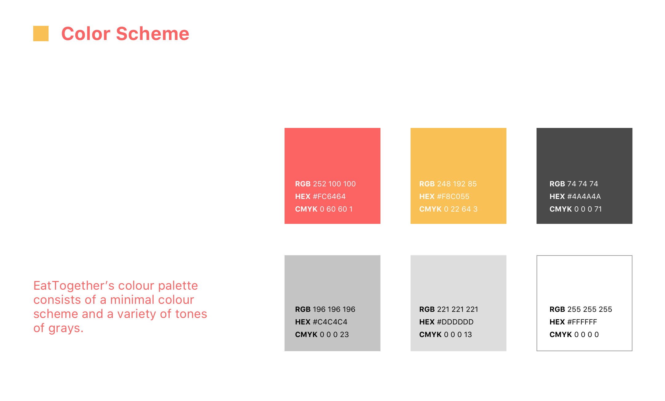
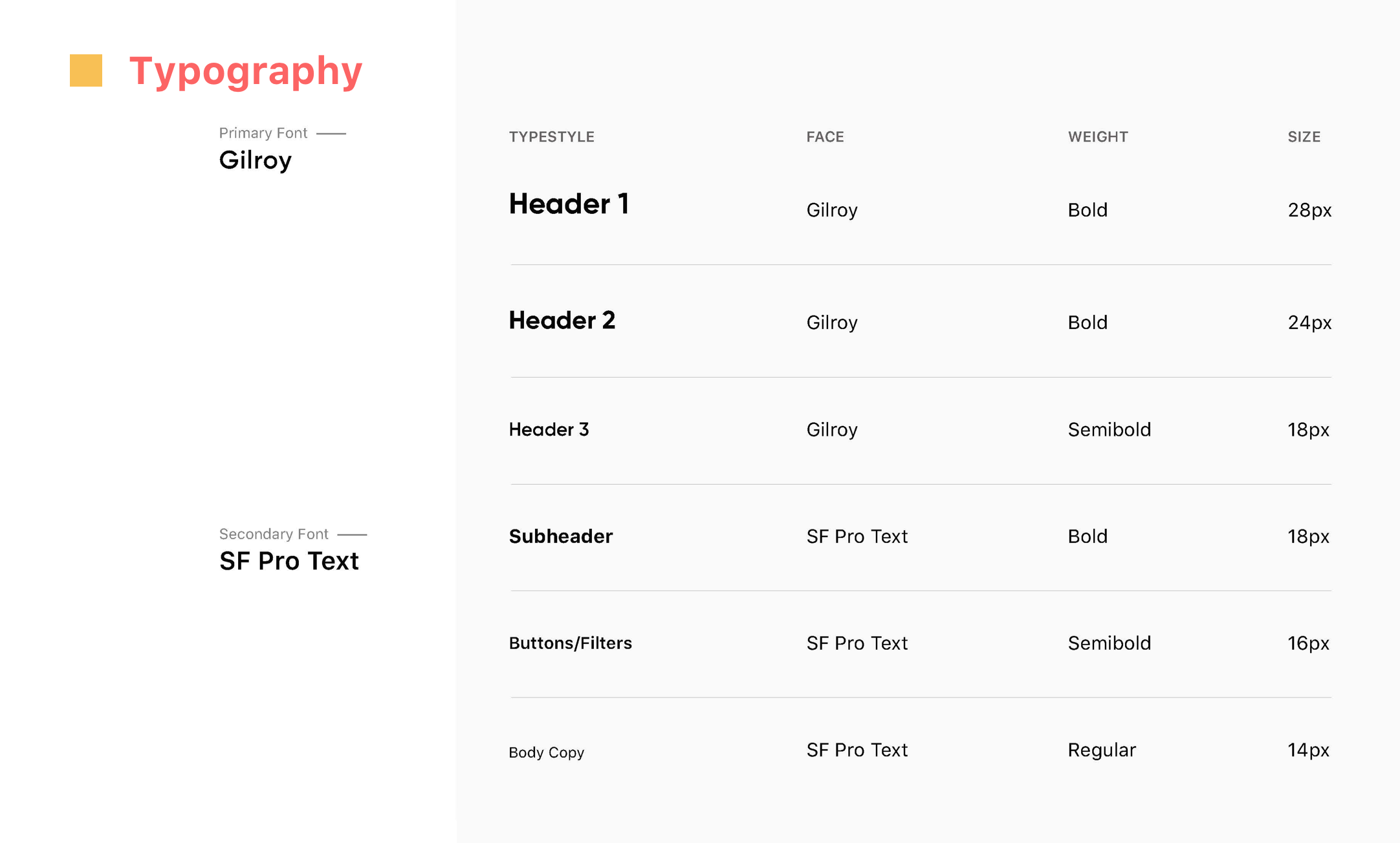
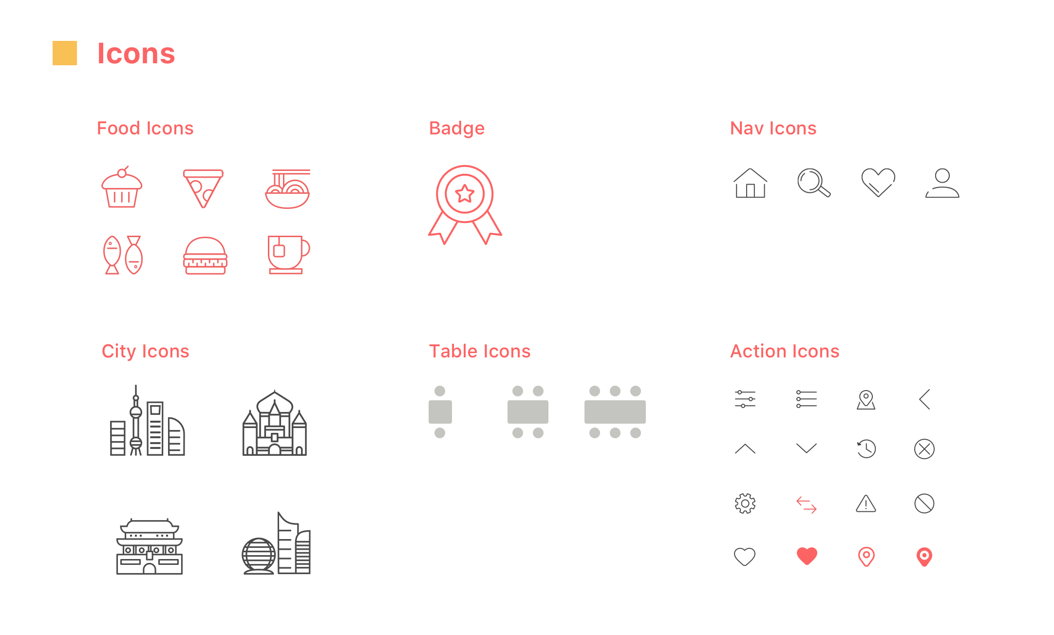
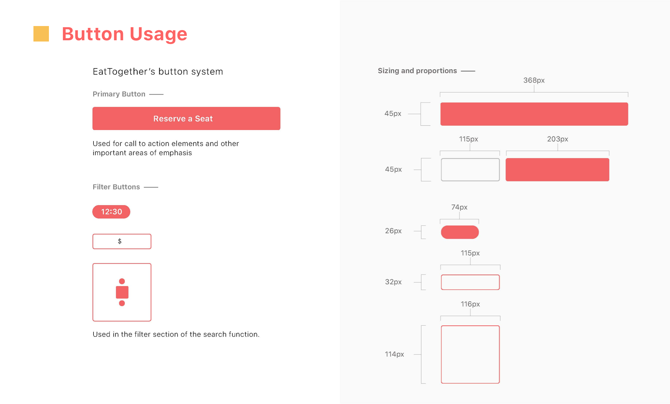
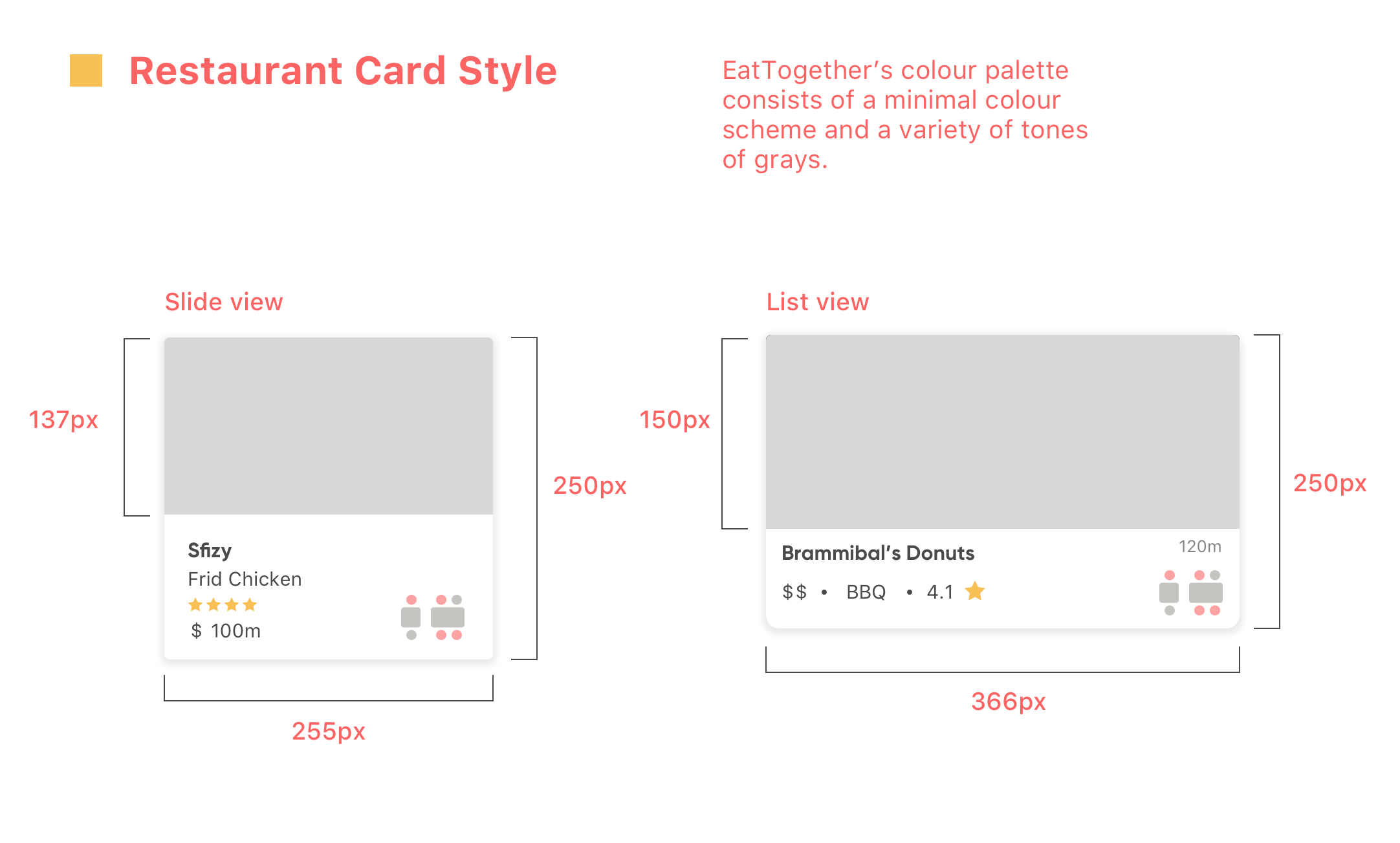
Before moving on to visual compositions with the wireframes we developed, we established a visual system to make sure that all the design elements were visually aligned together.
Final Deliverable
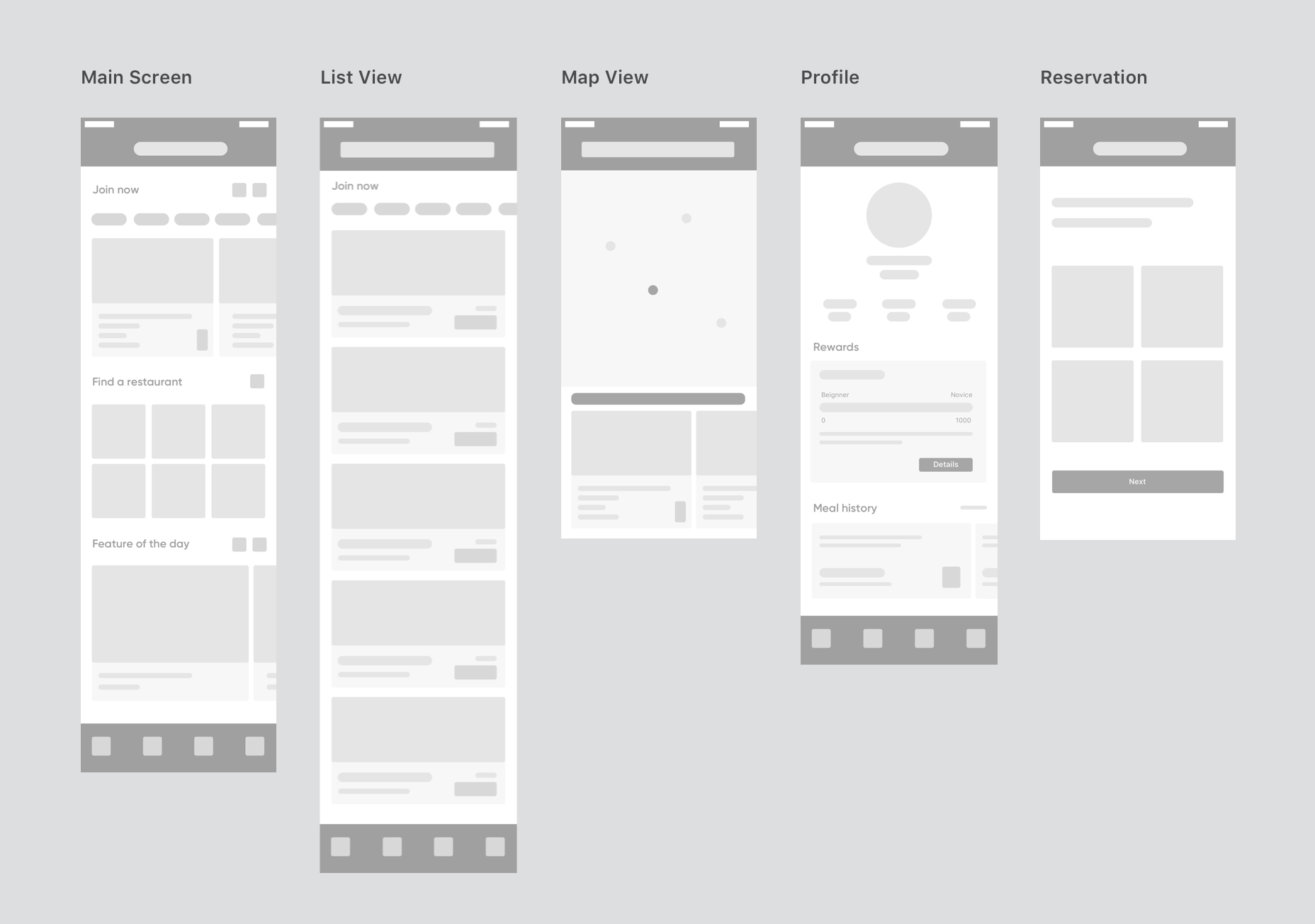
High-fidelity Wireframes
Visual Comps
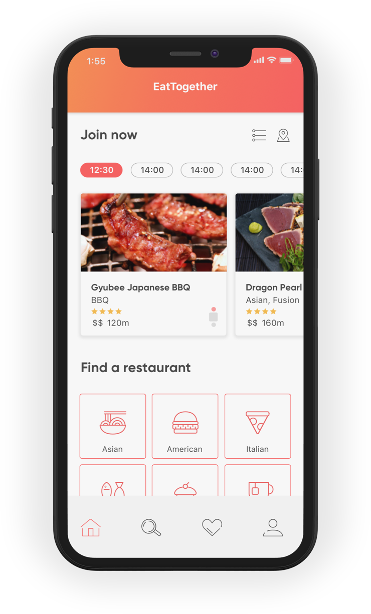
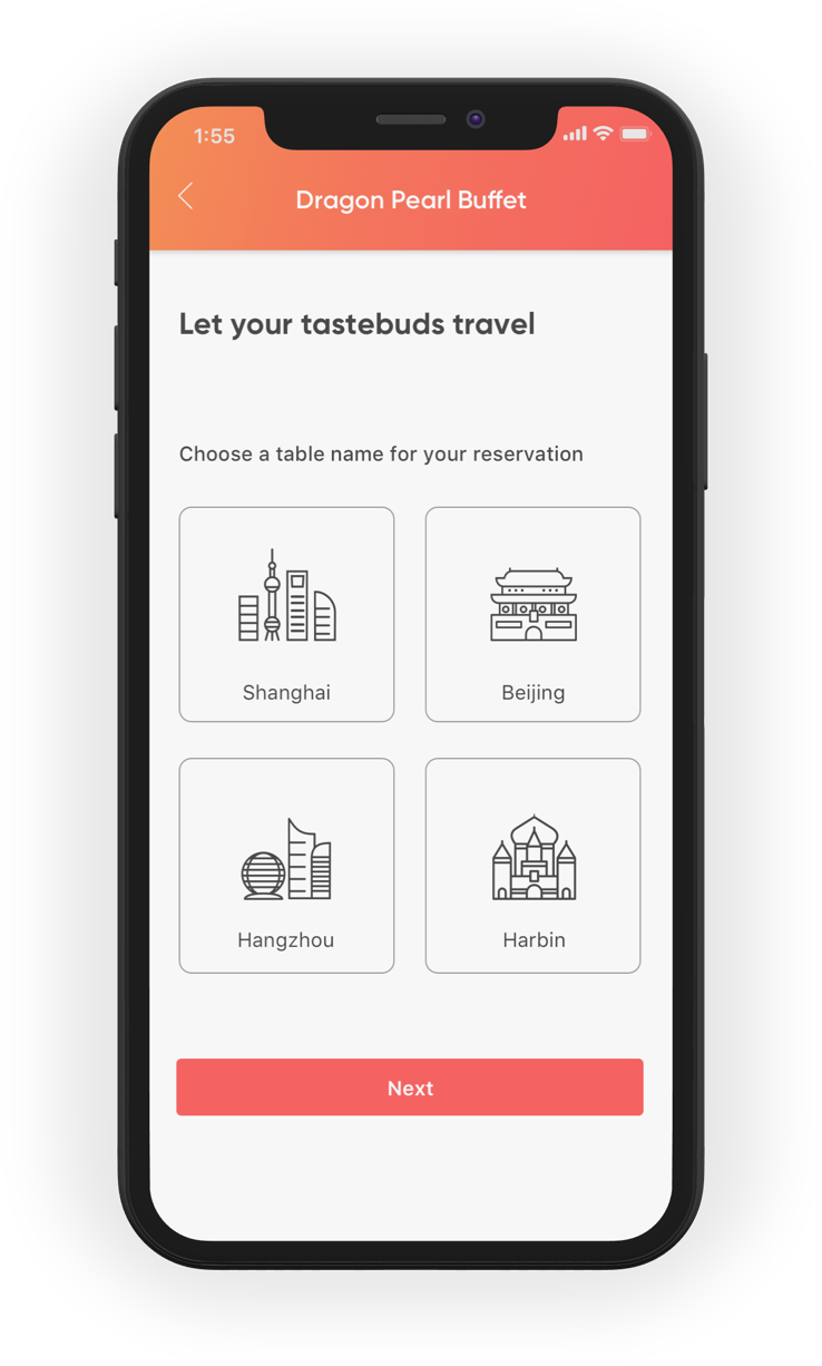
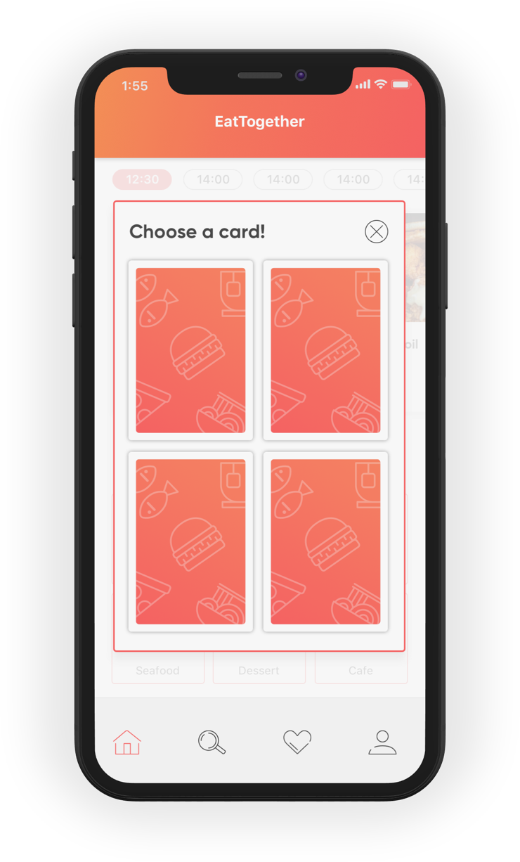
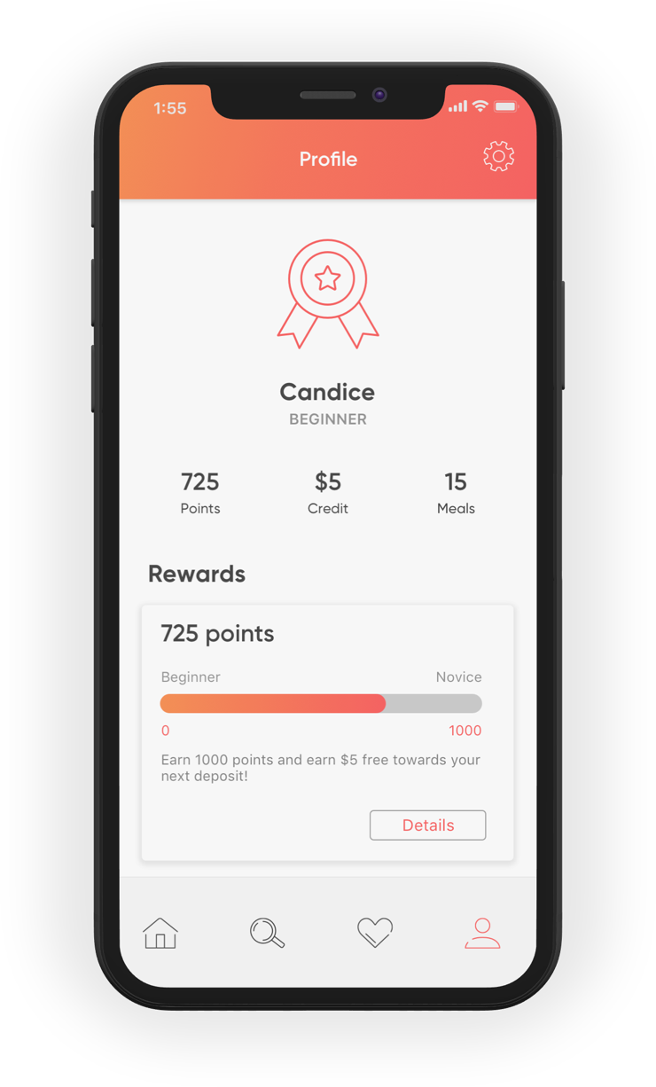
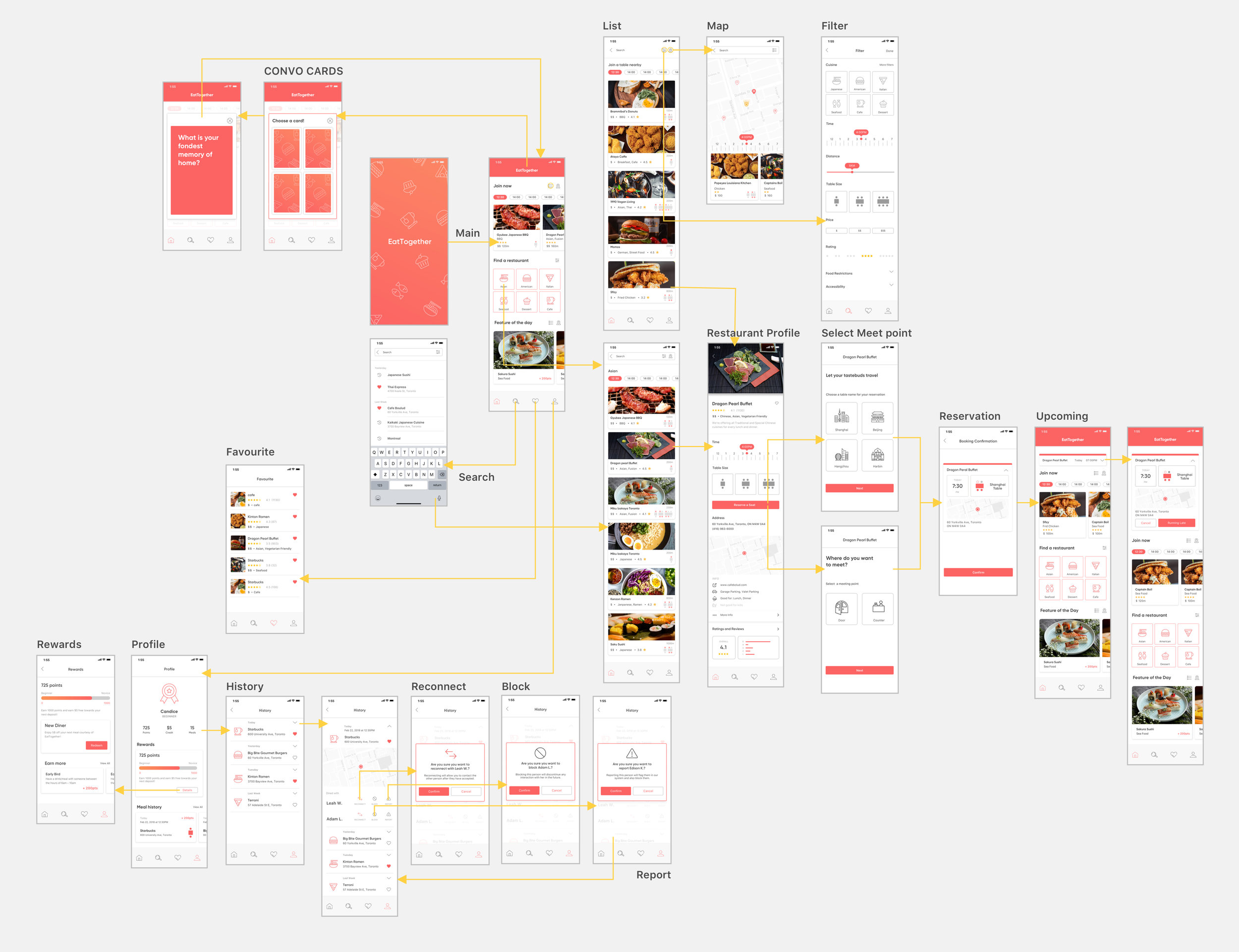
Live Prototype
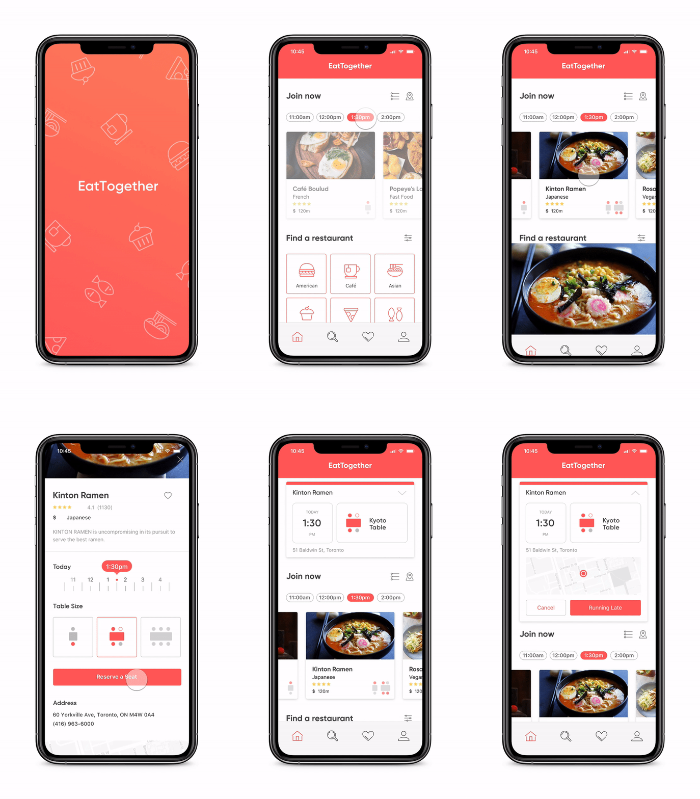
Quick Join someone’s table in the restaurant.

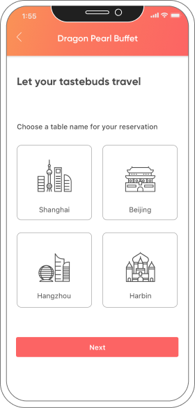
If no one is eating at the restaurant you want to go to, you can always start your own table.
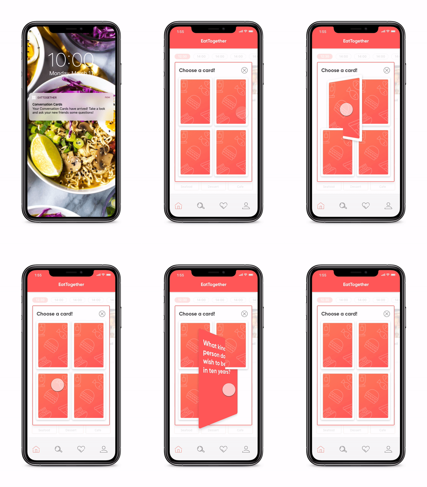
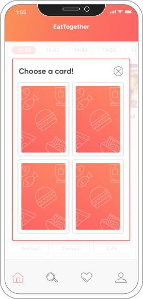
Check CONVO CARDS to switch up the conversations.
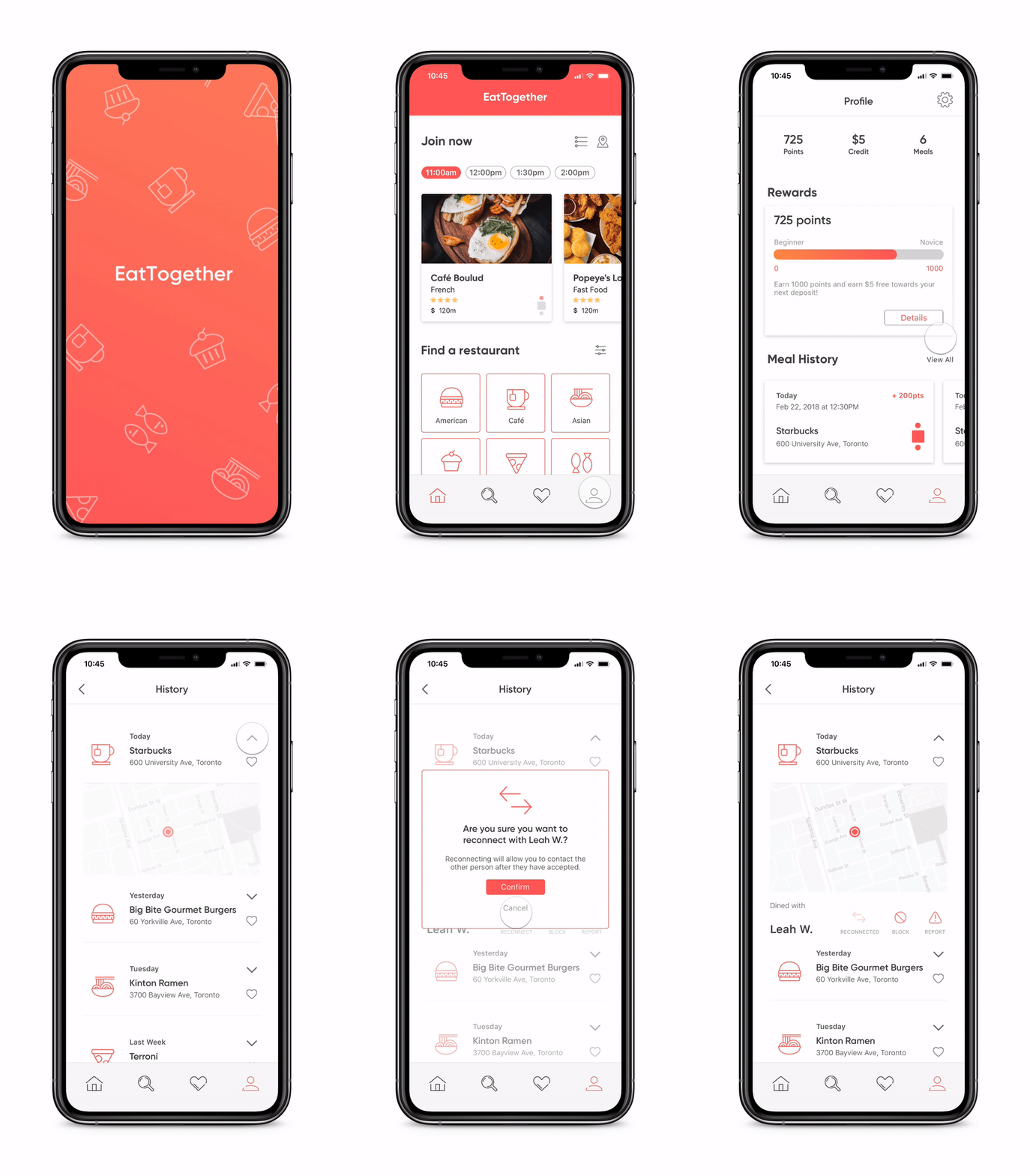
Reconnect with people you met!
Promotional Video
Selected Works

TaoBao RebrandBrand design
VolkswagenUI/UX Design
The Crazy OnesType in Motion

International Design AwardsType in Motion
Eat TogetherUI/UX Design
VisitERUX Design
Anti-HypeExperimental Graphic Design
Mi FitMi Fit
